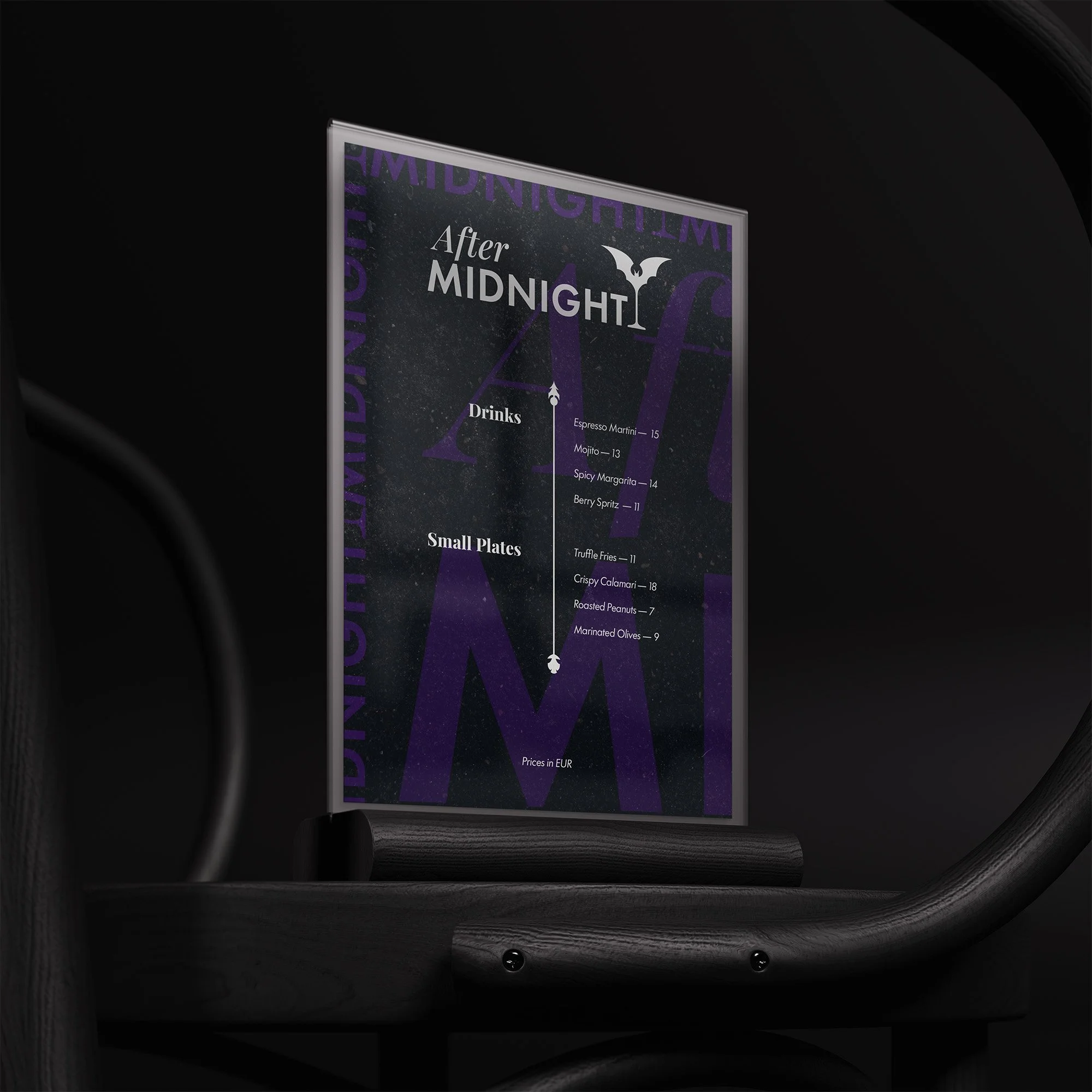
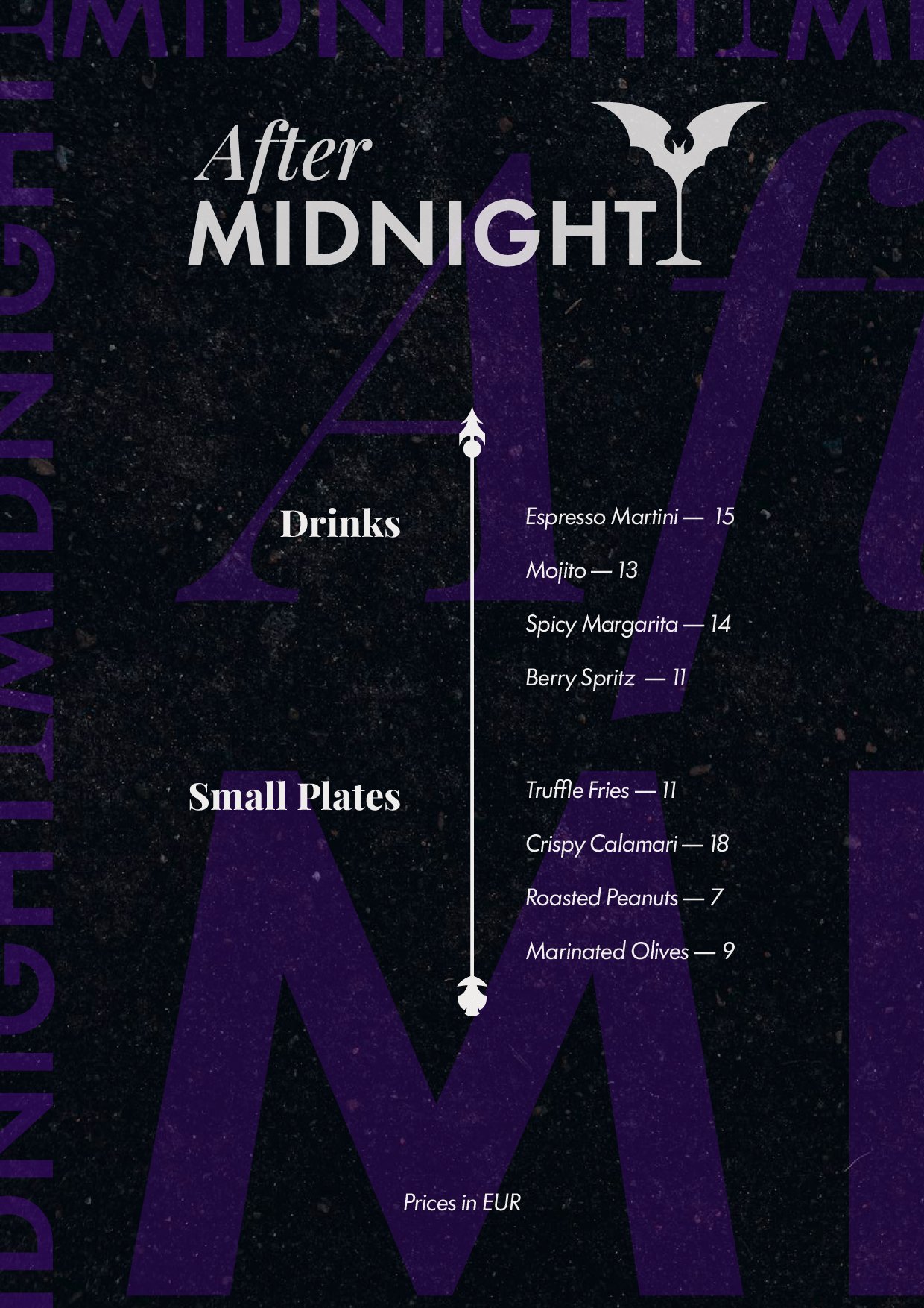
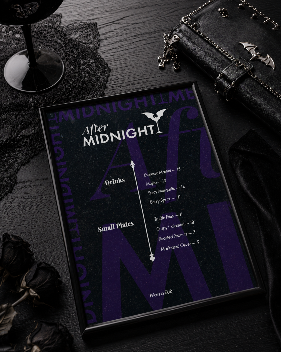
After Midnight is a one-day design challenge brief for a late-night cocktail bar and music venue. The brief provided menu content and requested a stylish layout with strong typography: no further creative direction was given. Rather than treating it as a pure layout exercise, I used it as an opportunity to build the foundations of a visual identity.
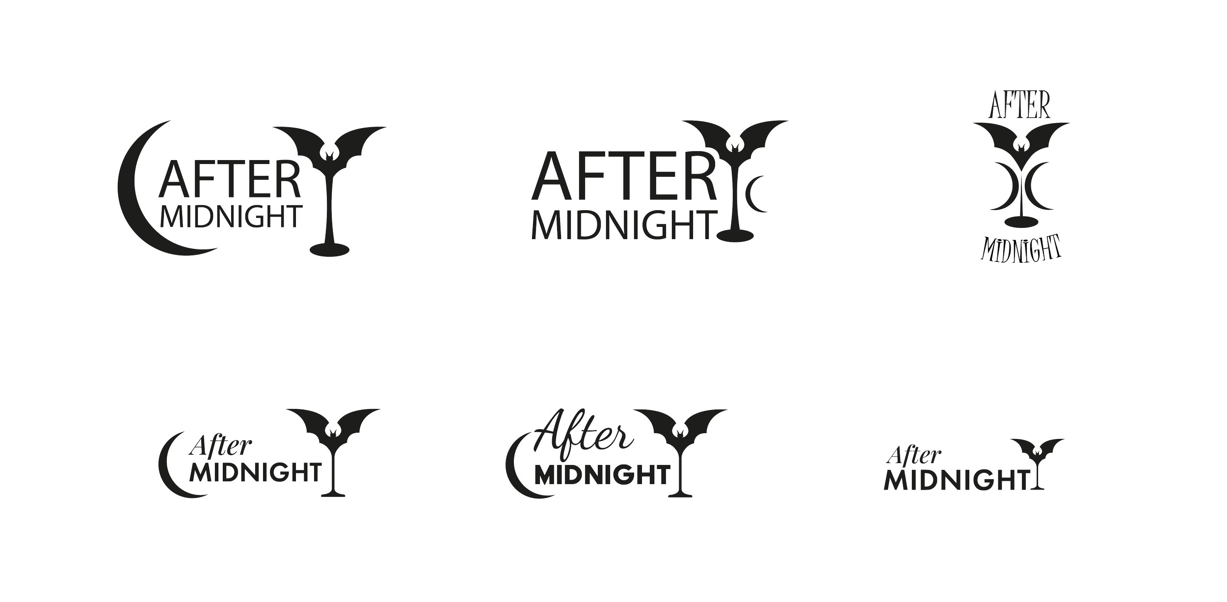
Several directions were explored before landing on the final mark.
The Logo
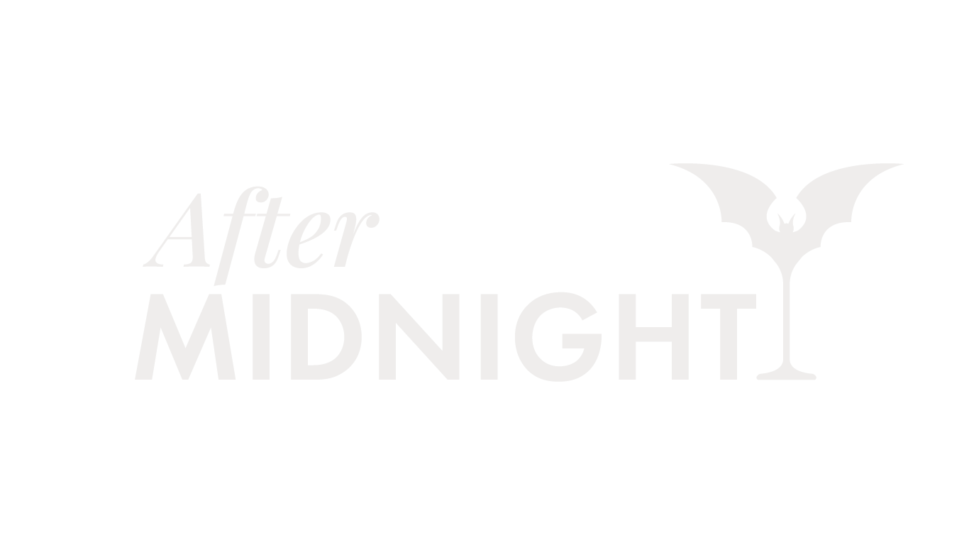
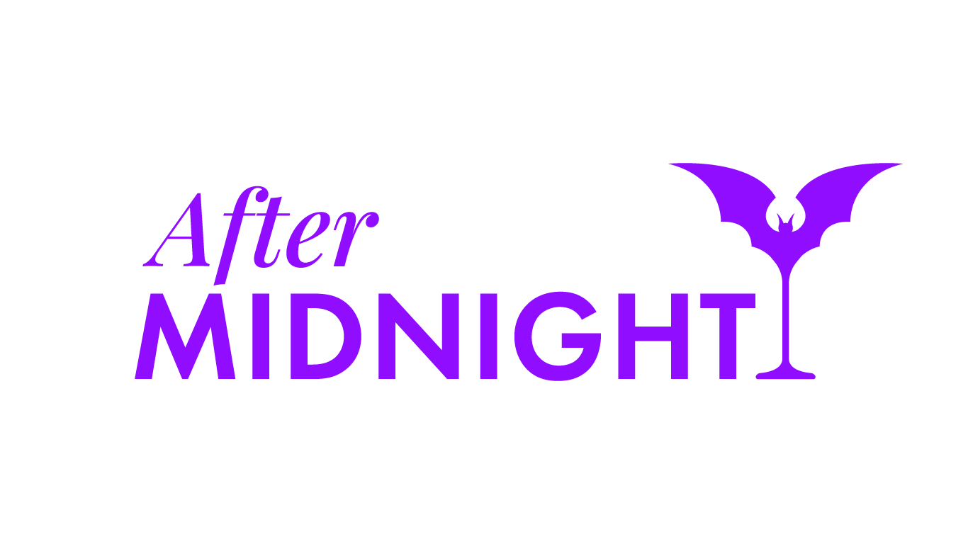
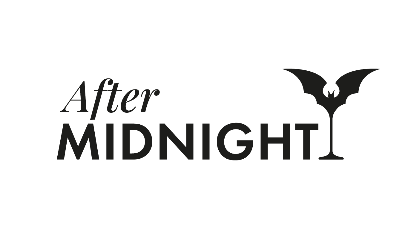
The wordmark pairs After in Playfair Display Medium Italic with MIDNIGHT in Futura PT Demi two typefaces in deliberate tension.
The icon completes the idea: a martini glass with bat wings, a detail that reads as playful at first glance and gothic on second look.
The logo is designed to be immediately legible and contemporary, with just enough darkness to signal what kind of night this is.
Typography
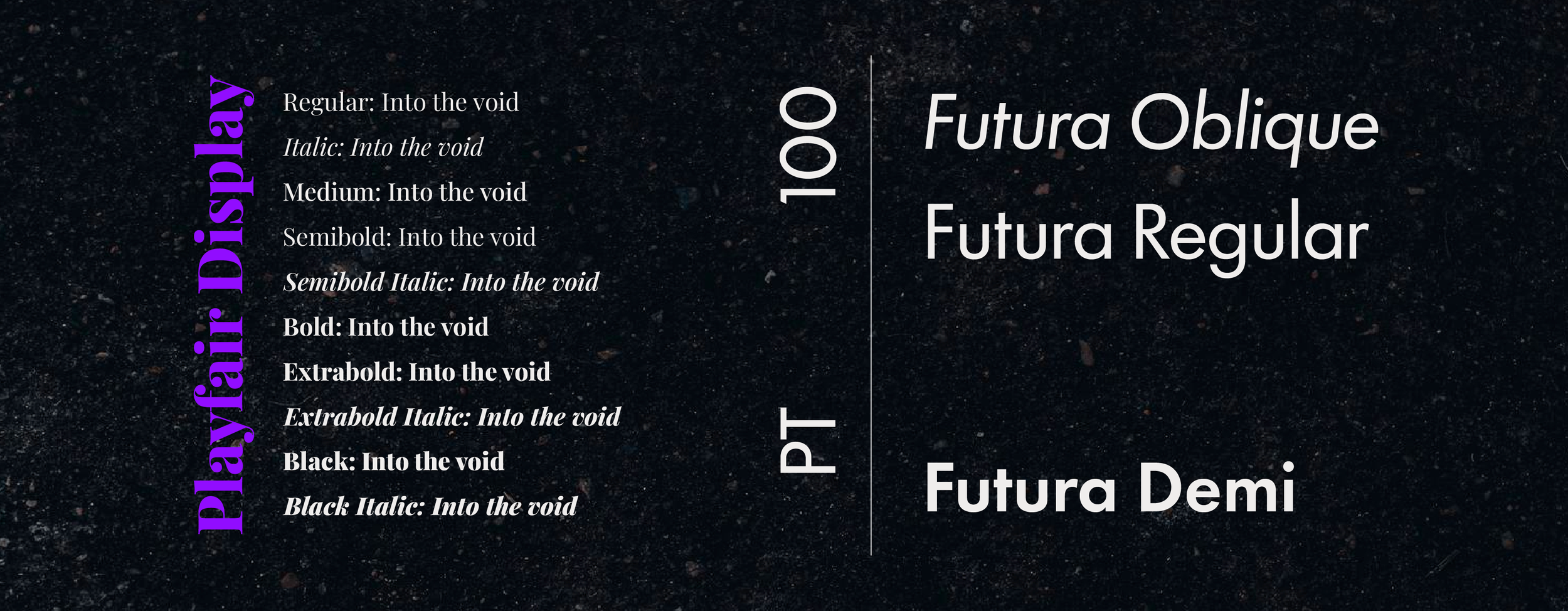
The typeface pairing was chosen for balance and tension in equal measure.
Playfair Display brings a gothic sensibility through its high-contrast serifs and dramatic italics, while Futura PT grounds the identity in geometric precision and contemporary restraint.
The two typefaces pull in opposite directions: organic vs mechanical, expressive vs structured, yet remain legible and coherent at every scale. Readability was non-negotiable: this is a working menu, not a mood piece.
Color Scheme
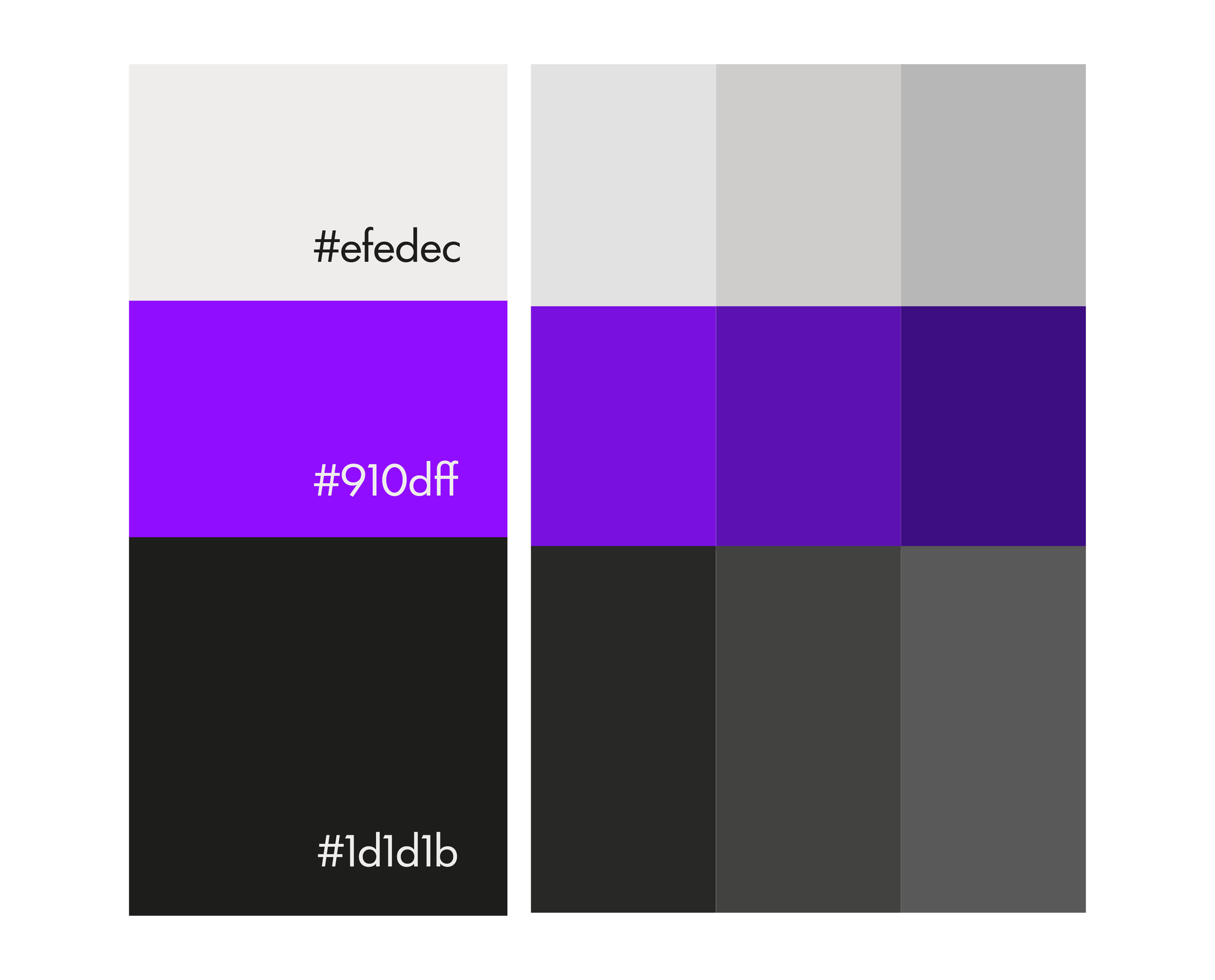
The colour palette is built on three primaries: near-black #1d1d1b, electric violet #910dff, and warm off-white #efedec.
The choice resists the expected gothic palette: no burgundy, no deep crimson, no gold. Instead, the violet reads as contemporary and high-energy against a carbon-warm black, while the off-white softens what could otherwise feel cold or aggressive. The result sits at the intersection of dark elegance and modern nightlife: gothic in attitude, not in costume.
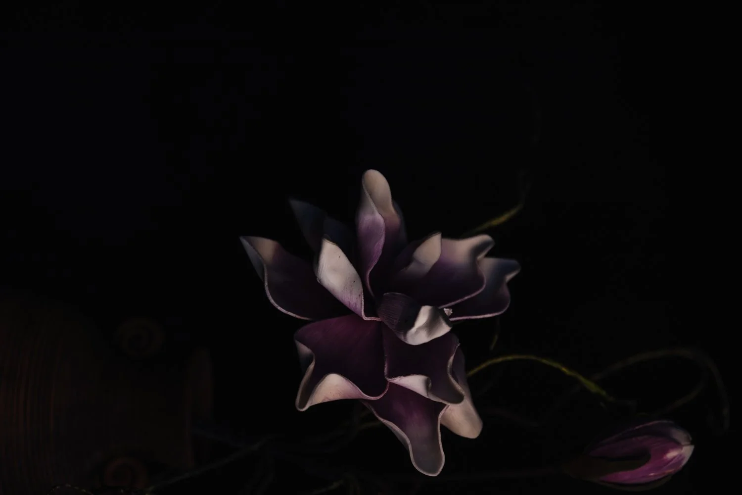
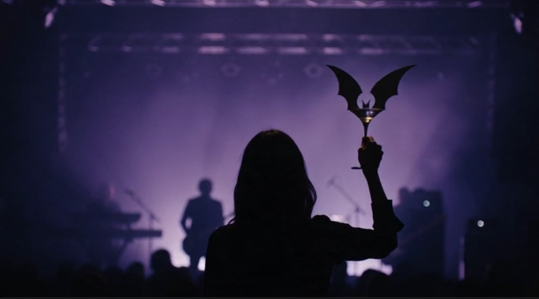

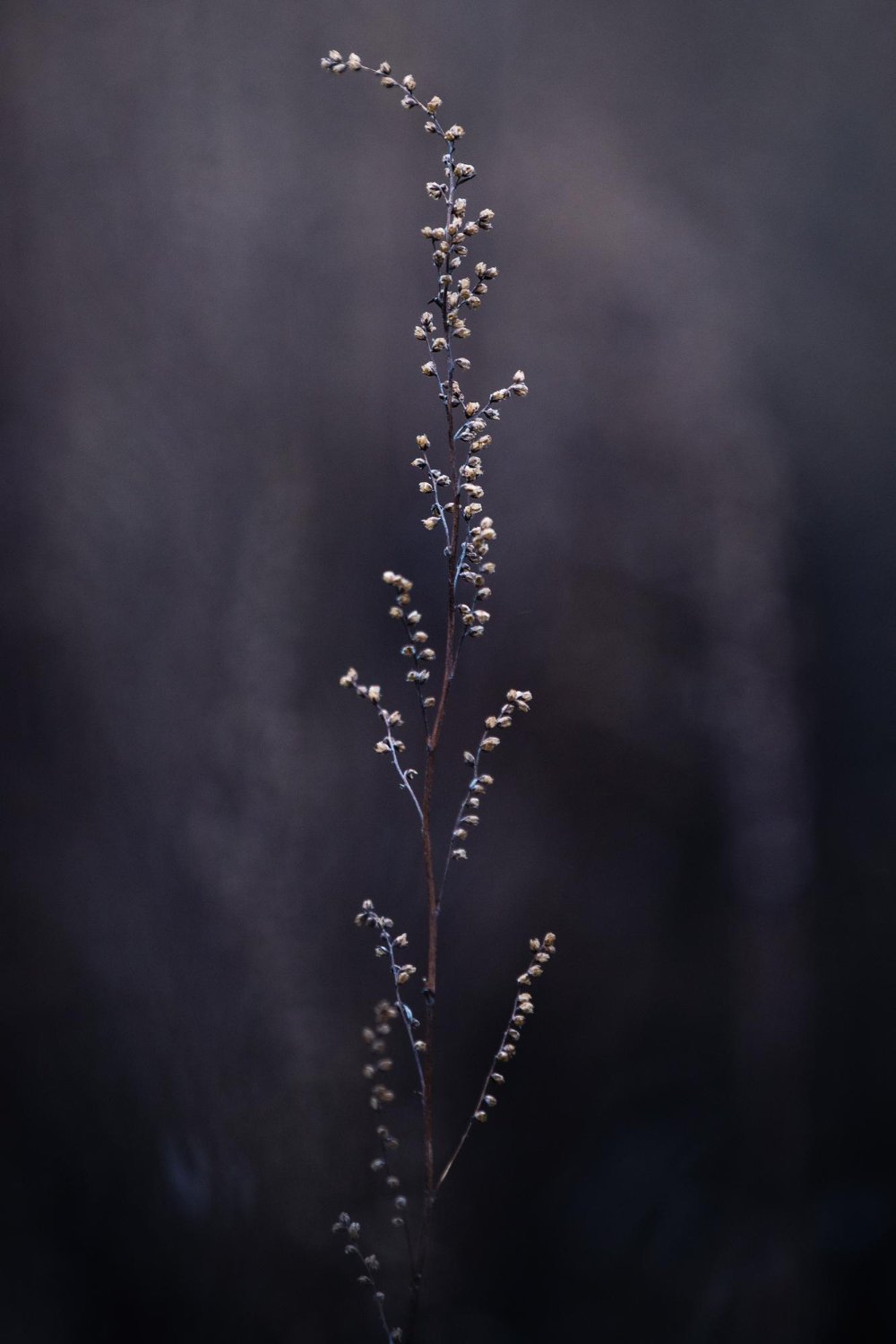
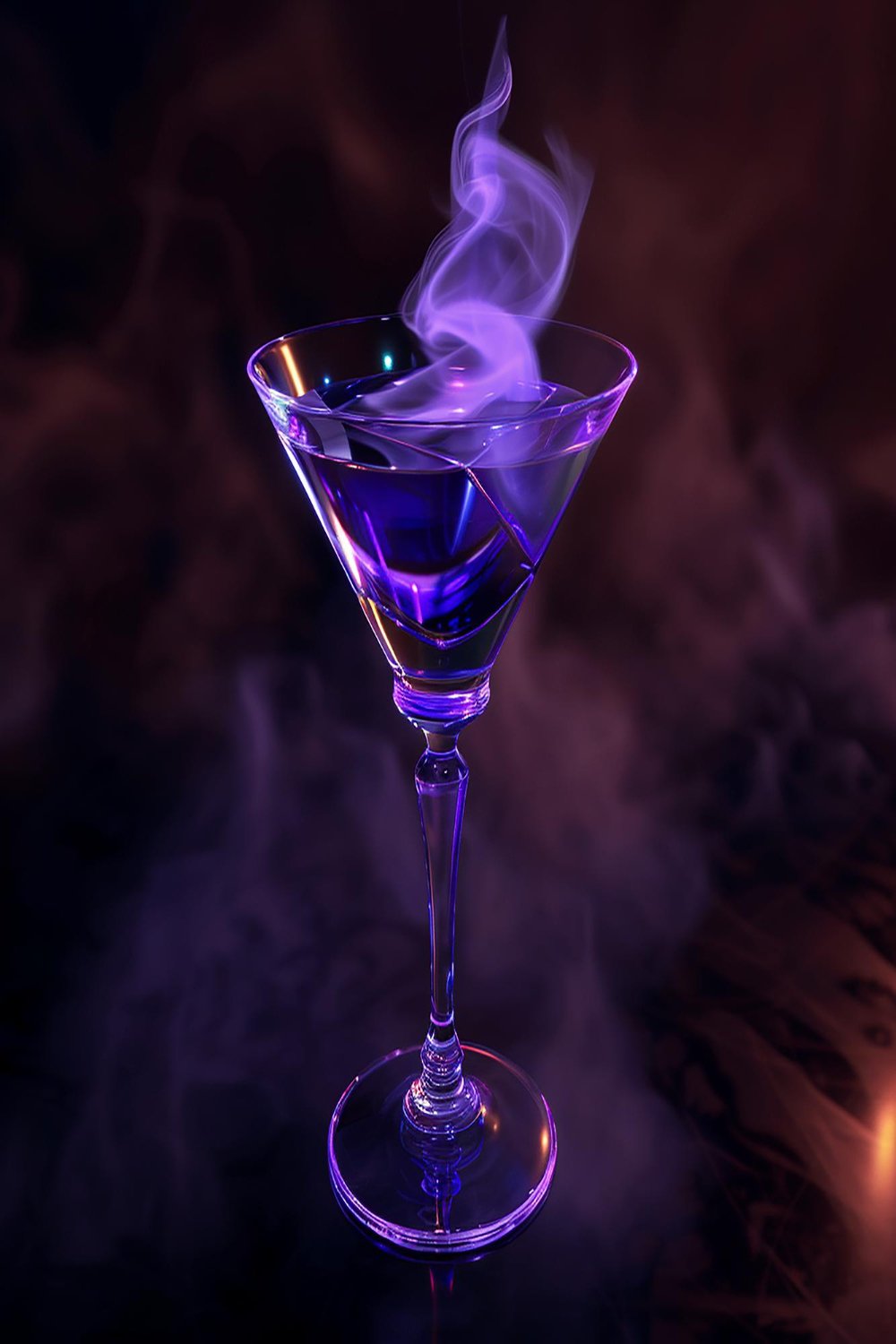
Moodboard and concept
After Midnight is built around a simple but specific idea: a place where dark music and good cocktails meet without apology. The visual world draws from soft goth and fashion-forward references rather than gothic clichés no clutter, no excess, no costume. Think Ann Demeulemeester, not Halloween.
The mood is cozy dark and intentionally intimate. Small venue, low ceilings, violet light, the kind of place where Twin Tribes or The Cure feel completely at home. Elegant but unpretentious. The references that shaped the identity sit closer to high-contrast fashion editorial and underground music culture than to conventional nightlife branding.
To bring the atmosphere to life beyond static design, a short AI-generated brand spot was conceived: a dark-haired woman in a small, dimly lit venue, back to the camera, holding a martini glass, a band barely visible through the haze. The logo appears at the end. No narration, no spectacle. Just the feeling of being there.
Mockups
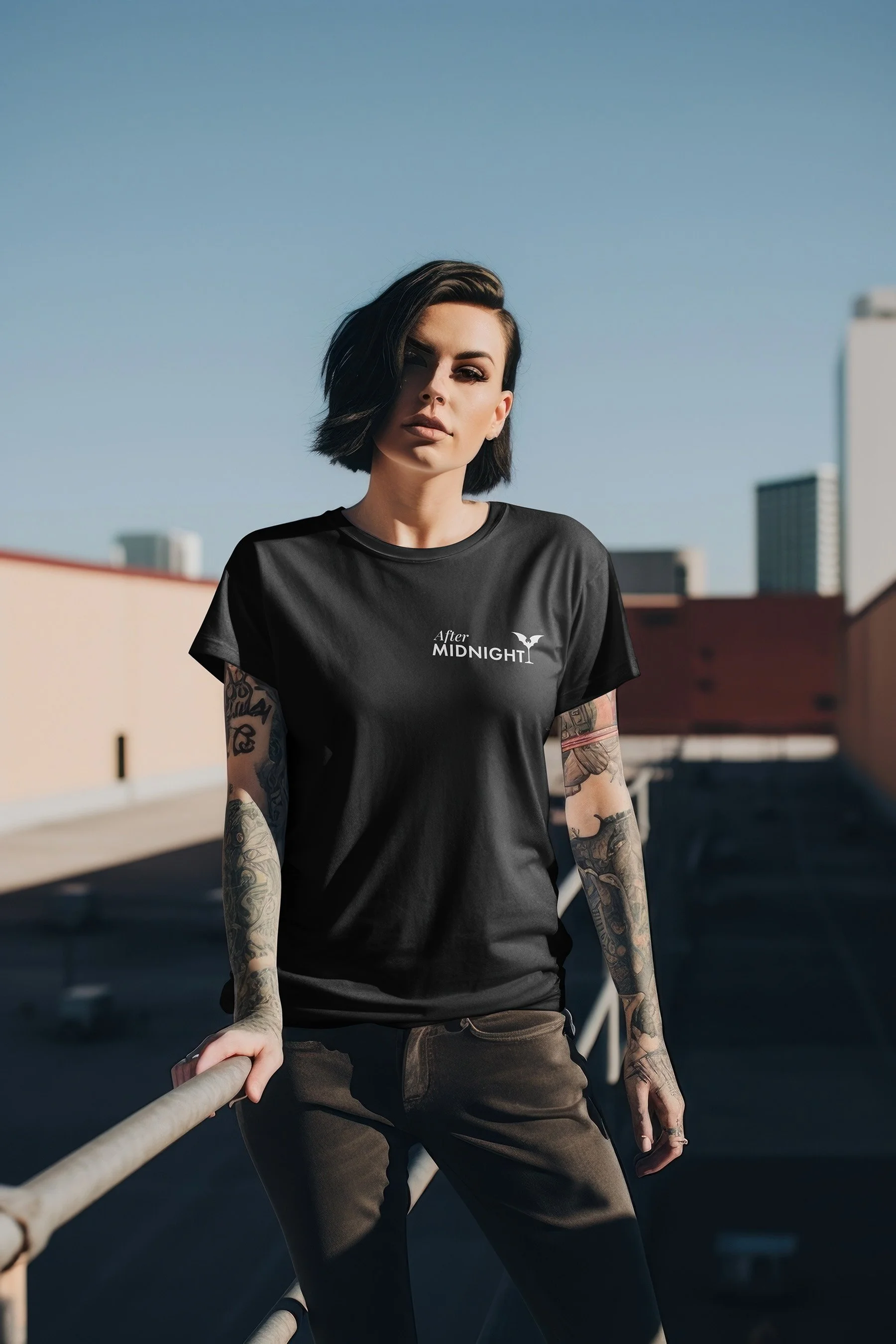
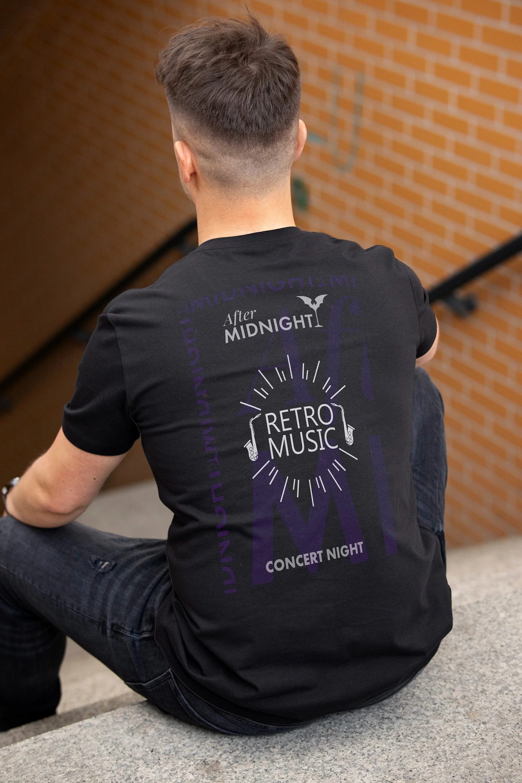
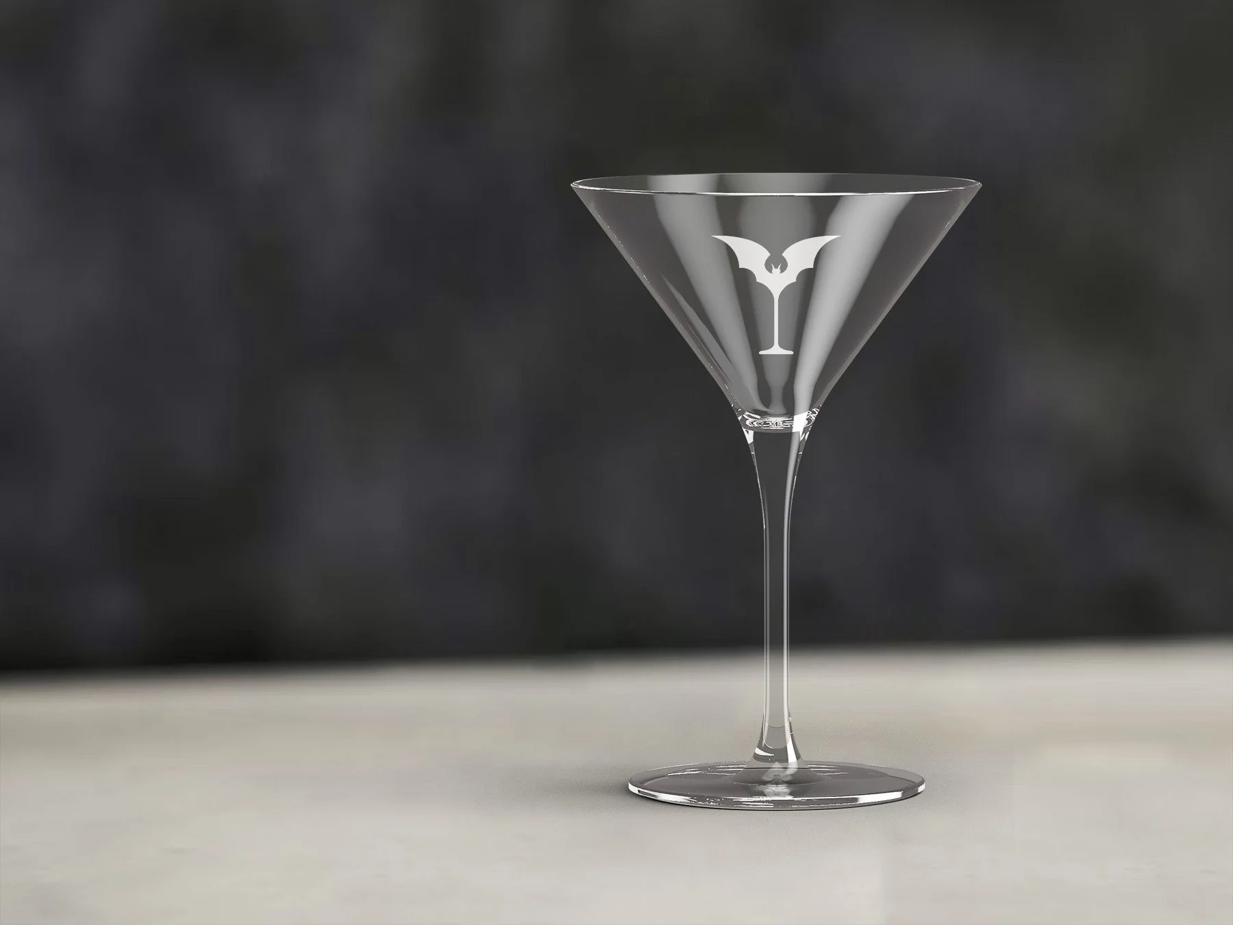
What I enjoy most in projects like this is starting from a single detail and building outward until the brief becomes a world.
After Midnight has more to say: event posters, branded objects, a space that feels like the identity made physical. This case study is the beginning of that.